Graphical Methods
| Home | | Advanced Mathematics |Chapter: Biostatistics for the Health Sciences: Systematic Organization and Display of Data
Using the BMI data, we will illustrate the following seven graphical methods: histograms, frequency polygons, cumulative frequency polygons, stem-and-leaf displays, bar charts, pie charts, and box-and-whisker plots.
GRAPHICAL METHODS
A second way to display data is through the use of
graphs. Graphs give the reader an overview of the essential features of the
data. Generally, visual aids provided by graphs are easier to read than tables,
although they do not contain all the detail that can be incorporated in a
table.
Graphs are designed to provide visually an
intuitive understanding of the data. Effective graphs are simple and clean:
thus, it is important that the graph be self-ex-planatory (i.e., have a
descriptive title, properly labeled axes, and an indication of the units of
measurement).
Using the BMI data, we will illustrate the
following seven graphical methods: histograms, frequency polygons, cumulative
frequency polygons, stem-and-leaf displays, bar charts, pie charts, and
box-and-whisker plots.
1. Frequency Histograms
As we mentioned previously, a frequency histogram
is simply a bar graph with the class intervals listed on the x-axis and the
frequency of occurrence of the values in the interval on the y-axis.
Appropriate labeling is important. For the BMI data described earlier, Figure
3.1 provides an appropriate example of a frequency histogram.
Proper graphing of statistical data is an art,
governed by what we would like to communicate. Several excellent books provide
helpful guidelines for proper graph-ics. Among the most popular books are two
by Edward Tufte [Tufte (1983, 1997)].
TABLE 3.5. Guidelines for Creating Frequency Distributions from Grouped Data
1. Find the range of values—the
difference between the highest and lowest values.
2. Decide how many intervals to
use (usually choose between 6 and 20 unless the data set is very large). The
choice should be based on how much information is in the distribution you wish
to display.
3. To determine the width of the
interval, divide the range by the number of class intervals selected. Round
this result as necessary.
4. Be sure that the class
categories do not overlap!
5. Most of the time, use equally
spaced intervals, which are simpler than unequally spaced intervals and avoid
interpretation problems. In some cases, unequal intervals may be helpful to
emphasize certain details. Sometimes wider intervals are needed where the data
are sparse.
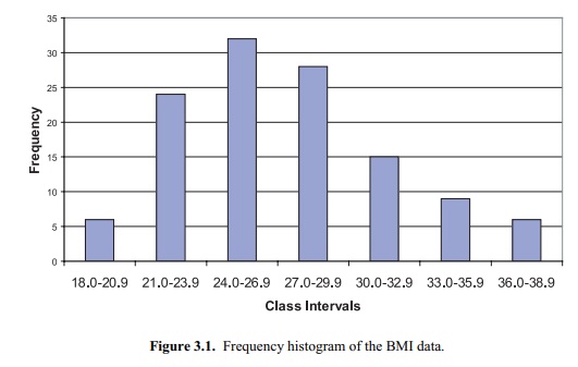
Figure 3.1. Frequency histogram of the BMI
data.
Huff’s (1954) popular book illustrates how playing
tricks with the scales on a plot can distort information and mislead the
reader. These experts provide sage guidance regarding construction of graphs.
Figure 3.2 provides a graph, called a relative
frequency histogram, of the same data as in Figure 3.1 with the height of the
y-axis represented by the relative frequency (%) rather than the actual
frequency. By comparing Figures 3.1 and 3.2, you can see that the shapes of the
graphs are similar.
Here the magnitude of the relative frequency is determined strictly by the height of the bar; the width of the bar should be ignored. For equally spaced class intervals, the height of the bar multiplied by the width of the bar (i.e., the area of the bar) also can represent the proportion of the cases in the given class.
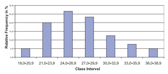
Figure 3.2. Relative frequency histogram for
the BMI data.
In Chapter 5, when we discuss probability
distributions, we will see that when properly defined, relative frequency
histograms are useful in approximating proba-bility distributions. In such
cases, the area of the bar represents the percentage of the cases in the
interval. When the class intervals have varying lengths, we need to adjust the
height of the bar so that the area, not the height, is proportional to the
per-centage of cases. For example, if two intervals each contain 10% of the
sampled cases but one has a width of 2 units and the other a width of 4 units,
we would re-quire that the intervals with width 4 units have one-half of the
height of the interval with a width of 2 units.
Figure 3.3 provides a relative frequency histogram
for the same BMI data except that we have combined the second and third and
fifth and sixth class intervals into one interval; the resulting frequency
distribution has five class intervals instead of the original seven.
The first, third, and fifth intervals all have a
width of 3 units, whereas the sec-ond and fourth intervals have a width of 6
units. Consequently, the relative per-centages are represented correctly by the
height of the histogram but not by the area. The excessive height of the second
and fourth intervals is corrected by di-viding the height (i.e., frequency) of
these intervals by 2. Figure 3.4 shows the ad-justed histogram.
Figure 3.5 presents a cumulative frequency
histogram in which the frequency in the interval is replaced by the cumulative
frequency, as we demonstrated in the cu-mulative frequency tables. The
analogous figure for cumulative relative frequency (%) is shown in Figure 3.6.
2. Frequency Polygons
Frequency polygons are very
similar to frequency histograms. However, instead of placing a bar across the
interval, the height of the frequency or relative frequency is
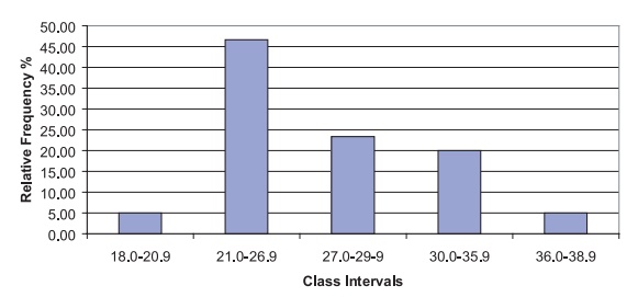
Figure 3.3. BMI data: relative frequency
histogram with unequally spaced intervals.
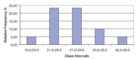
Figure 3.4. BMI data: relative frequency histogram with unequally spaced intervals (height adjusted for correct area).
Figures 3.7 and 3.8 represent, respectively, a
frequency polygon and relative fre-quency polygon for the BMI data. These
figures are analogous to the histograms presented in Figures 3.1 and 3.2,
respectively.
3. Cumulative Frequency Polygon
A cumulative frequency polygon, or ogive, is
similar to a cumulative frequency his-togram. The height of the function represents
the sum of the frequencies in all the class intervals up to and including the
current one. The only differences between a cumulative frequency polygon and a
cumulative frequency histogram are that the height is taken at the midpoint of
the class interval and the points are connected by straight lines instead of
being represented by bars. Figures 3.9 and 3.10 represent, respectively, the
cumulative frequency polygon and cumulative relative frequency polygon for the
BMI data.
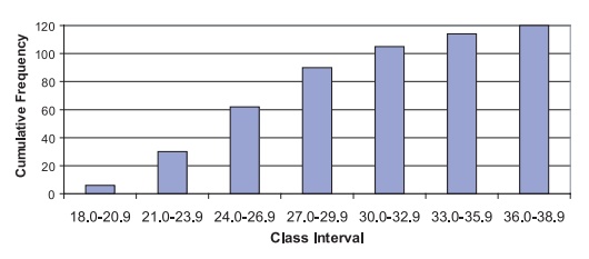
Figure 3.5. Cumulative frequency histogram
for BMI data.
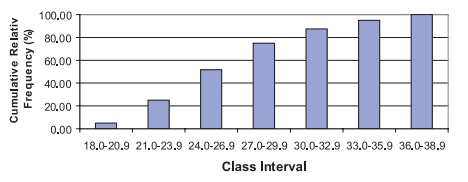
Figure 3.6. Cumulative relative frequency
histogram for BMI data.
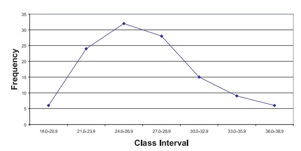
Figure 3.7. Frequency polygon for BMI data.
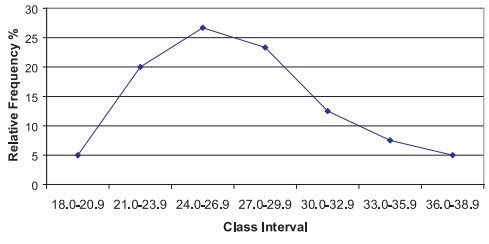
Figure 3.8. Relative frequency polygon for
BMI data.
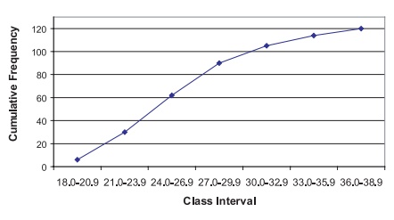
Figure 3.9. Cumulative frequency polygon
(ogive) for BMI data.
4. Stem-and-Leaf Diagrams
Histograms summarize a dataset and provide an idea
of the shape of the distribution of the data. However, some information is lost
in the summary. We are not able to reconstruct the original data from the
histogram.
John W. Tukey created an innovation in the 1970s
that he termed the “stem-and-leaf diagram.” Tukey (1977) elaborates on this
method and other innovative exploratory data analysis techniques. The
stem-and-leaf diagram not only provides the desirable features of the
histogram, but also gives us a way to reconstruct the entire data set from the
diagram. Consequently, we do not lose any information by con-structing the
plot.
The basic idea of a stem-and-leaf diagram is to
construct “stems” that represent the class intervals and to have “leaves” that
exhibit all the individual values. Let us demonstrate the technique with the
BMI data. Recall that these data ranged from a lowest value of 18.3 to a
highest value of 38.8. The class groups will be the integer part of each
number; any value from 18.0 to 18.9 will belong to the first stem, from 19.0 to
19.9 to the second stem, and continuing to the highest value in the dataset.
Figure 3.10. Cumulative relative frequency
polygon for BMI data.
To form the leaves, we place a single digit for
each observation that belongs to that class interval (stem). The value used
will be the single digit that appears after the decimal point. If a particular
value is repeated in the data set, we repeat that val-ue on the leaf as many
times as it appears in the data set. Usually the numbers on the leaf are placed
in increasing order. In this way, we can exhibit all of the data. Inter-vals
that include more observations than others will have longer leaves and thus
produce the frequency appearance of a histogram. The display of the BMI data
is:
18. 3
19. 28
20. 278
21. 111335999
22. 333457789
23. 011345
24. 000112335667788
25. 04446778899
26. 255569
27. 1333344444556
28. 233346778889
29. 358
30. 01238899
31. 01366
32. 68
33. 62
34. 289
35. 0589
36. 6
37. 158
38. 28
From this display, we are able to reach several
conclusions about the frequency of cases in each interval and the shape of the
distribution, and even reconstruct the original dataset, if necessary. First,
it is apparent that the intervals that contain the highest and second-highest
frequencies of observations are 24.0 to 24.9 and 25.0 to 25.9, respectively.
Also, empty or low-frequency intervals such as 36.0 to 36.9 are recognized
easily. Second, the shape of the distribution is also easy to visualize; it
resembles a histogram placed sideways. The individual digits on the leaves
repre-sent all of the 120 observations.
The frequencies associated with each of the class
intervals are calculated by to-taling the number of digits on the corresponding
leaf. Each individual value can be reconstructed by observing its stem and leaf
value. For example, the 9 in the fourth row of the diagram represents the value
“21.9” because 21 is the stem for that row and 9 is the leaf value. The stem
represents the digits to the left of the decimal place and the leaf the digit
to the right.
Table 3.5 reconstructs the stem-and-leaf diagram
shown in the foregoing dis-play. In addition, the table illustrates the class
interval associated with the stem and provides the frequency counts obtained
from the leaves.
5. Box-and-Whisker Plots
John W. Tukey created another scheme for data
analysis, the box-and-whisker plot. The box-and-whisker plot provides a
convenient and compact picture of the general shape of a data distribution.
Although it contains less information than a histogram, the Box-and-Whisker
plot can be very useful in comparing one distribution to other distributions.
Figure 3.11 presents a box-and-whisker plot in which the distribution of
weights is compared for patients diagnosed with cancer, diabetes, and coronary
heart disease. From the figure, we can see that although the distributions
overlap, the average weight increases for each of these diagnoses.
To define a box-and-whisker plot, we must give
definitions of several terms related to the distribution of a data set; these
terms are the median, a-percentile, and
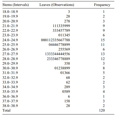
TABLE 3.5. Stem-and-Leaf Display for BMI Data
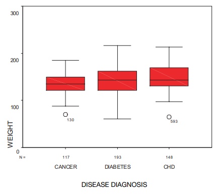
Figure 3.11. Box-and-whisker plot for female
patients who have cancer, diabetes, and coronary heart disease (CHD). (Source: Robert Friis, unpublished data.)
The median of a data set
is the value of the observation that divides the ordered dataset in half.
Essentially, the median is the observation whose value defines the midpoint of
a distribution; i.e., half of the data fall above the me-dian and half below.
A precise mathematical definition of a median is as
follows: If the sample size n is odd,
then n = 2m + 1, where m is an
integer greater than or equal to zero. The me-dian then is taken to be the
value of the m + 1 observation
ordered from smallest to largest. If the sample size n is even, then n = 2m where m is an integer greater than or equal to 1. Any value between the mth and m + 1st values ordered from smallest to largest could be the
median, as there would be m observed
values below it and m observed values
above it. When n is even, a
convention that makes the median unique is to take the average of the mth and m + 1st observations (i.e., the sum of the two values divided by
2).
The α-percentile is defined as the value such that a percent of the observations have values lower than the α -percentile value; 100 – α percent of the observations are
above the a-percentile value. The quantity α is a number between 0 and 100. The median is a special case in which
the α = 50.
We use specific a-percentiles
for box-and-whisker plots. We can draw these plots either horizontally, or
vertically as in the case of Figure 3.11. The a-per-centiles
of interest are for α = 1, 5, 10, 25, 50, 75, 90, 95, and 99. A box-and-whisker plot, based
on these percentiles, is represented by a box with lines (called whiskers)
extending out of the box in both north and south directions. These lines
terminate with bars perpendicular to them. The lower end of the box represents
the location of the 25th percentile of the distribution. Inside the box, a line
is drawn to mark the location of the median, or 50th percentile, of the
distribution. The upper end of the box represents the location of the 75th
percentile of the distribution.
The length of the box is called the interquartile
range, the range of values that constitute the middle half of the data. Out of
the upper and lower ends of the box are the lines extending to the
perpendicular bars called whiskers, which represent ex-tremes of the
distribution.
While there are no consistent standards for
defining the extremes, people who construct the plots need to be very specific
about the meaning of these extremes. Often, these extremes correspond to the
smallest and largest observations, in which case the length from the end of the
whisker on the bottom to the end of the whisker on the top is the range of the
data.
In many applications, the ends of the whiskers
represent a-percentiles. For ex-ample, choices can be 1 for the end of the lower
whisker and 99 for the end of the upper whisker, or 5 for the lower whisker and
95 for the upper whisker. The forego-ing are the most common choices; however,
sometimes 10 and 90 are used for the lower and upper whiskers, respectively.
Sometimes, we consider the minimum (i.e., the
smallest value in the data set) and the maximum (i.e., the largest value in the
data set) to be the ends of whiskers. In this text, we will assume that the
endpoints of the whiskers are the minimum and maximum values of the data. If
other percentiles are used, we will be careful to state their values.
The box plot is very useful for indicating the
presence or absence of symmetry and for comparing spread or variability of two
or more data sets. If the distribution is not symmetric, it is possible that
the median will not be in the center of the box and that the whiskers will not
be the same length. Looking at box plots is a very good first step to take when
analyzing data.
If a box-and-whisker plot indicates the presence of
symmetry, the distribution may be a normal distribution. Symmetry means that if
we split the distribution (i.e., probability density function) at the median,
the half to the right will be the mirror image of the half to the left. For a
box-and-whisker plot that shows a symmetric dis-tribution: (1) the median will
be in the middle of the box; and (2) the right and left whiskers will have
equal lengths. Regardless of the definition we choose for the ends of the
whiskers, points one and two will be true.
Concluding this section, we note that Chapters 5
and 6, respectively, describe probability distributions and the normal
distribution. The normal, or Gaussian, dis-tribution is a symmetric
distribution used for many applications. When the data come from a normal
distribution, the sample should appear to be nearly symmetric. So for normally
distributed data, we expect the box-and-whisker plot to have a me-dian near the
center of the box and whiskers of nearly equal width. Large deviations from the
model of symmetry suggest that the data do not come from a normal
distri-bution.
6. Bar Graphs and Pie Charts
Bar graphs and pie charts are useful tools for
summarizing categorical data. A bar graph has the same form as a histogram.
However, in a histogram the values on the x-axis represent intervals of
numerically ordered data. Consequently, as we move from left to right on the
x-axis, the intervals represent increasing values of the vari-able under study.
As categorical data do not exhibit ordering, the ordering of the bars is
arbitrary. Meaning is assigned only to the height of the bar, which represents
the frequency or relative frequency of occurrence of cases that belong to that
partic-ular class interval. In addition, the width of the bar has no meaning.
Pie charts depict the same information as do bar
graphs, but in the shape of a circle or pie. The circle is divided into
wedges, one for each category of the data. The size of each wedge is determined
by its angular measurement. Since a circle contains 360°, a wedge that
contains 50% of the cases would have an angular measurement of 180°. In
general, if the wedge is to contain a percent of the cases, then the angle for the wedge
will be 360a/100°. Figure 3.12 illustrates a pie chart of categorical data. Using data
from a research study of clinic patients, the figure presents the proportions
of female patients who were diagnosed with cancer, diabetes, and coronary
heart disease.
We can use pie charts also to represent ordinal
data. Table 3.6 presents data regarding a characteristic called the Pugh
level, a measure of the severity of liver dis-ease. Figure 3.13 illustrates
these data in the form of a pie chart. Based on 24 pediatric patients with
liver disease, this pie chart presents ordinal data, which indicate severity of
the disease. As an alternative to a pie chart, Figure 3.14 shows a bar graph
for the same Pugh data presented in Table 3.6.
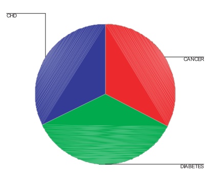
Figure 3.12. Pie chart—proportions of patients
diagnosed with cancer, diabetes, and coronary heart dis-ease (CHD). (Source:
Robert Friis, unpublished data.)
TABLE 3.6. Pugh Categories and Pugh Severity Levels
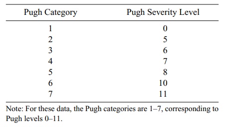
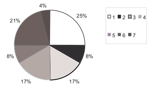
Figure 3.13. Pie chart for Pugh level for 24 children with liver disease.
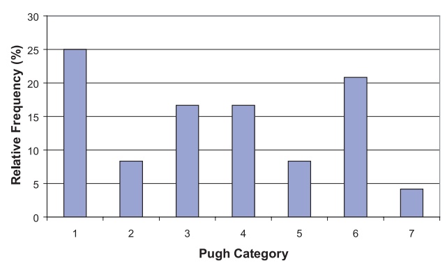
Figure 3.14. Relative frequency bar graph for Pugh categories of 24 pediatric patients with liver dis-ease.
Related Topics