The Scatter Diagram
| Home | | Advanced Mathematics |Chapter: Biostatistics for the Health Sciences: Correlation, Linear Regression, and Logistic Regression
A scatter diagram is used to portray the relationship between two variables; the relationship occurs in a sample of ordered (X, Y) pairs.
THE SCATTER DIAGRAM
A scatter diagram is used to portray the
relationship between two variables; the relationship occurs in a sample of
ordered (X, Y) pairs. One constructs such a diagram by plotting, on Cartesian
coordinates, X and Y measurements (X and Y pairs) for each
subject. As an example of two highly correlated measures, consider systolic and
diastolic blood pressure. Remember that when your blood pressure is measured,
you are given two values (e.g., 120/70). Across a sample of subjects, these two
values are known to be highly correlated and are said to form a linear
(straight line) relationship.
Further, as r
decreases, the points on a scatter plot diverge from the line of best fit. The
points form a cloud—a scatter cloud—of dots; two measures that are
uncorrelated would produce the interior of a circle or an ellipse without
tilt. Table 12.1
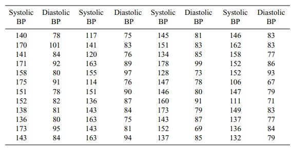
TABLE 12.1. Systolic and Diastolic Blood Pressure Values for a Sample of 48 Elderly Men
In order to produce a scatter diagram, we take a
piece of graph paper and draw X and Y axes. The X axis (horizontal axis) is
called the abscissa; it is also used to de-note the independent variable that
we have identified in our analytic model. The Y axis (vertical axis), or
ordinate, identifies the dependent, or outcome, variable. We then plot variable
pairs on the graph paper.
For example, the first pair of measurements (140,
78) from Table 12.1 comprises a point on the scatter plot. When we plot all of
the pairs in the table, the result is the scatter diagram shown in Figure 12.2.
For the blood pressure data, the choice of the X or Y axes is arbitrary, for
there is no independent or dependent variable.
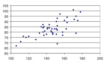
Figure 12.2. Scatter diagram of systolic and
diastolic blood pressure (using data from Table 12.1).
Related Topics