Frequency Tables and Histograms
| Home | | Advanced Mathematics |Chapter: Biostatistics for the Health Sciences: Systematic Organization and Display of Data
A frequency table provides one of the most convenient ways to summarize or dis-play grouped data.
FREQUENCY TABLES AND HISTOGRAMS
A frequency table provides one of the most
convenient ways to summarize or dis-play grouped data. Before we construct such
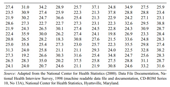
a table, let us consider the following numerical data. Table 3.1 lists 120
values of body mass index data from the 1998 National Health Interview Survey.
The body mass index (BMI) is defined as [Weight (in kilograms)/Height (in
meters) squared]. According to established standards, a BMI from 19 to less
than 25 is considered healthy; a BMI from 25 to less than 30 is regarded as
overweight; a BMI greater than or equal to 30 is defined as obese. Table 3.1
arranges the numbers in the order in which they were collected.
In constructing a frequency table for grouped data,
we first determine a set of class intervals that cover the range of the data
(i.e., include all the observed values). The class intervals are usually
arranged from lowest numbers at the top of the table to highest numbers at the
bottom of the table and are defined so as not to overlap. We then tally the
number of observations that fall in each interval and present that number as a
frequency, called a class frequency.
TABLE 3.1. Body Mass Index for a Sample of 120 U.S. Adults
Some frequency tables include a column that represents the frequency as a
percentage of the total number of obser-vations; this column is called the
relative frequency percentage. The completed fre-quency table provides a frequency
distribution.
Although not required, a good first step in
constructing a frequency table is to re-arrange the data table, placing the
smallest number in the first row of the leftmost column and then continuing to
arrange the numbers in increasing order going down the first column to the top
of the next row. (We can accomplish this procedure by sorting the data in
ascending order.) After the first column is completed, the proce-dure is
continued starting in the second column of the first row, and continuing un-til
the largest observation appears in the rightmost column of the bottom row.
We call the arranged table an ordered array. It is
much easier to tally the obser-vations for a frequency table from such an
ordered array of data than it is from the original data table. Table 3.2
provides a rearrangement of the body mass index data as an ordered array.
In Table 3.2, by inspection we find that the lowest
and highest values are 18.3 and 38.8, respectively. We will use these numbers
to help us create equally spaced intervals for tabulating frequencies of data.
Although the number of intervals that one may choose for a frequency
distribution is arbitrary, the actual number should depend on the range of the
data and the number of cases. For a data set of 100 to 150 observations, the
number chosen usually ranges from about five to ten. In the present example,
the range of the data is 38.8 – 18.3 = 20.5. Suppose we divide the data set
into seven intervals. Then, we have 20.5 ÷ 7 = 2.93, which rounds to 3.0. Consequently,
the intervals will have a width of three. These seven intervals are as follows:
1. 18.0 – 20.9
2. 21.0 – 23.9
3. 24.0 – 26.9
4. 27.0 – 29.9
5. 30.0 – 32.9
6. 33.0 – 35.9
7. 36.0 – 38.9
TABLE 3.2. Body Mass Index Data for a Sample of 120 U.S. Adults: Ordered Array (Sorted in Ascending Order)
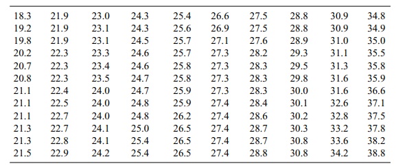
Table 3.3 presents a frequency distribution and a
relative frequency distribution (%) of the BMI data.
A cumulative frequency (%) table provides another
way to display a frequency distribution. In a cumulative frequency (%) table,
we list the class intervals and the cumulative relative frequency (%) in
addition to the relative frequency (%). The cu-mulative relative frequency or
cumulative percentage gives the percentage of cases less than or equal to the
upper boundary of a particular class interval. The cumula-tive relative
frequency can be obtained by summing the relative frequencies in a particular
row and in all the preceding class intervals. Table 3.4 lists the relative
fre-quencies and cumulative relative frequencies for the body mass index data.
A histogram presents the same
information as a frequency table in the form of a bar graph. The endpoints of
the intervals are displayed as the x-axis; on the y-axis
TABLE 3.3. Body Mass Index (BMI) Data (n = 120)
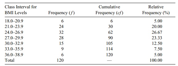
TABLE 3.4. Relative Frequency Table of BMI Levels
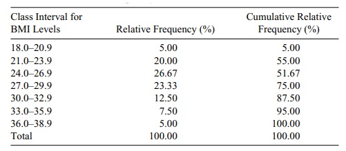
Table 3.5 summarizes Section 3.2 by providing
guidelines for creating frequency distributions of grouped data.
Related Topics